POSTS
PhD tool: The CQOCE diagram
by Luis P. Prieto, - 15 minutes read - 3108 wordsBy far, this is the tool (as in, “thinking tool”) which I recommend most often to PhD students. This diagram summarizes your main research questions, thesis contributions and evidence of their usefulness. While painful to make, this brutal synthesis exercise is also a powerful communication tool. In this post, I explain how it works, its origins, and how making 18+ versions of it helped me through my PhD. Copy the provided template and use it in your PhD supervision meetings or even in the PhD defense!
“It’s too hard… I’m blank”.
“I don’t really know what to put there”.
“It keeps changing all the time”.
I’ve heard almost every kind of complaint about this tool. However, I still have to find a Ph.D. student that tells me that doing it was useless. It is hard to summarize years of hard work (past and future) into a single page but, as many creative writers will tell you1, being able to distill the most important ideas of a 400-page book into a single page, leads to a clarity of ideas that is often lacking.
This is the first of a series of posts on “PhD tools”: structures, conceptual frameworks or actual hardware/software tools that I (and others) have found useful to advance the Ph.D. dissertation, across different fields. There is lots of general advice out there on how to do diagrams (e.g., for your literature review papers), but not so many that are directly useful for defining the thesis itself. Of course, there are too many research fields and traditions out there, so this particular structure may not fit your particular situation. But I suggest you give it a go - you may be surprised!
Origins
I first came across this thinking tool when doing my own Ph.D. at GSIC-EMIC, a inter-disciplinary educational technologies lab at the University of Valladolid, in Spain. Back there, it was common advice to fill up one such diagram, once your thesis topic was more or less defined2. Spending an hour diagramming quickly made you realize that things were not as clear as you initially thought, and that your research contributions had more holes than a piece Gruyère cheese…
I originally thought that this was just a common researcher device in use everywhere, pretty much like Ellis’s problem-goal-question schema3 – also very recommendable, by the way. However, my later travels around different labs have convinced me that this kind of exercise is not common at all (which is why I think this post can be useful). Thus, the diagram is a truly “home-brewed” thing4, which evolved in an iterative manner since its first (partial) appearance in Asensio-Pérez’s thesis5, throughout several other theses6,7, my own thesis8 and beyond9. We all modified it slightly to fit our particular needs. And we all agree that it was a very useful device to define, understand and communicate our own research.
Let’s hope it helps you too.
What it is
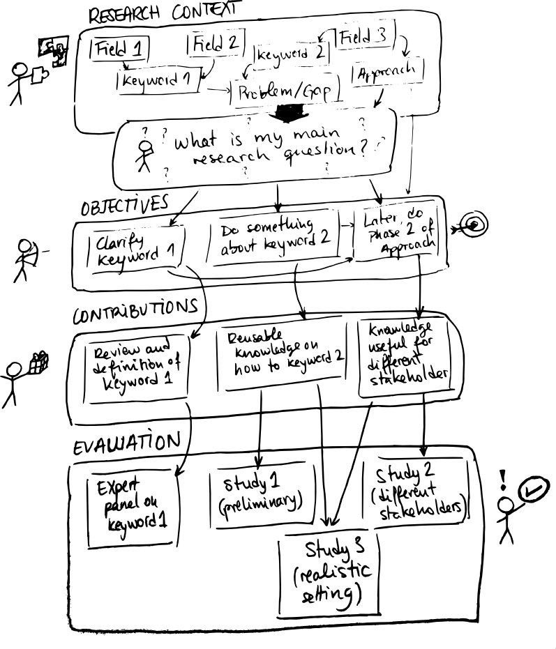
As you can see in the thesis references above, the diagram is commonly used in the introduction section of a dissertation, and it is meant to introduce, in graphical form, some of its main elements: the research Context, main research Question, Objectives, Contributions of your thesis and their Evaluation. However, many of us have also used it way before starting to write the dissertation book itself, as a “guiding star” when discussing with others and planning the thesis work. Below you can see an generic example of such a diagram10. Let’s look at each of the elements that make it up:
- Context. As in, “research context”. This box is meant to convey where your research sits within the scientific community or communities that are close to what you do. At the beginning of your Ph.D., this box may contain just the name of 1-2 research fields, and/or very general topics within them that interest you. However, as you read more and more literature and understand your field and what is interesting for you, it can become quite specific (see the examples from my own thesis below). Generally, it is also very important to lay out here what is the main problem that you have detected in current research, the “hole” in the current state-of-the-art that your thesis intends to “plug”. This basically gives the why of your thesis: what is wrong with our current knowledge of the world, that your thesis tries to make right?
- Research Question. Probably one of the most obnoxious habits of old professors that one meets randomly during the Ph.D., is to ask: “Oh, so you are a doctoral student here… and what is your research question?”. This often leads to the student answering evasively and trying to scurry away. Aside from its obnoxiousness, this question has another interesting property: it is very good at signaling the maturity of a student. If you are able to understand that you are here to further human knowledge, you have identified clearly something that is not known, and formulated it in a single sentence that is actually a question and can be answered with data in a reasonable amount of time, you are almost 50% of the way there (yet another reason why making this diagram is useful). This main research question is probably the element of the diagram that changes most often throughout the Ph.D., normally in the direction from “very general, almost impossible to answer even with unlimited funds and manpower”, to “very specific and convoluted, but with some chance of being answered by a single person in a few years”.
- Objectives: This box tries to answer the question of how would you go about finding out the answer to your research question above. However, it is not really a plan yet: rather, it tries to “decompose” your research question into more manageable elements, either conceptually (for instance, looking independently into different concepts/keywords that appear in your main research question) or temporally (dealing with A is needed before trying to investigate B).
- Contributions: This is probably the trickiest element of the diagram to fill in, and the one which I get most questions about. I’ll probably do a separate post on the whole “What counts as a research contribution?” question, but here goes the two-sentence version: It is whatever previously unknown, reusable knowledge that you propose or produce during your research, which materializes the answer to your research question. The main problem is that what counts as valid knowledge depends a lot on your research field - which is why you need more experienced peers (like your supervisor, or reading papers from other people in your field), to guide you in defining this. For instance, in many fields (especially, applied ones), a research contribution has to be: a) novel (nobody has done the same or a very similar thing); b) feasible (it can be done practically, it is not just some futuristic fantasy); and c) useful (something that solves an important, relevant problem for some stakeholder). Another tip: very often (but not always), contributions are linked to the different objectives you laid out in the previous box (e.g., each objective is materialized in a contribution that fulfills the objective).
- Evaluation: Once you have decided what your contribution(s) is/are, you only need to prove that it works as you say it does, e.g., that it is novel, feasible and useful. In many fields, this involves gathering data of some kind from the world, using whatever means at your disposal (from huge radio-telescopes to asking a single person in an interview). This box thus tries to represent graphically how the different data gathering events that you organize, provide this proof for the value of the different contributions you define, to meet the objectives and finally answer the research question of your thesis (see the over-complex examples from my thesis in the figure below).
If all this sounds terribly abstract and vague to you, don’t worry, you are in good company (everyone thinks so at the beginning). Hopefully, an example will help bring some clarity… but then again, maybe not, if you are in a field very far away from mine. Therefore, take the example if it helps you, but do not consider it the only way of doing this!
How I used it during my Ph.D.
Going through my archives from the thesis period, I have found at least 18 different versions of this diagram (hence, not counting those I quickly drew on paper and never made it into my hard drive). Below, you can see three examples spanning the three years that my Ph.D. work lasted: a first one from about six months into the actual Ph.D. work (hand-drawn on the left, mostly in Spanish), another one from around the middle, and the final one that appeared on my dissertation (on the right).
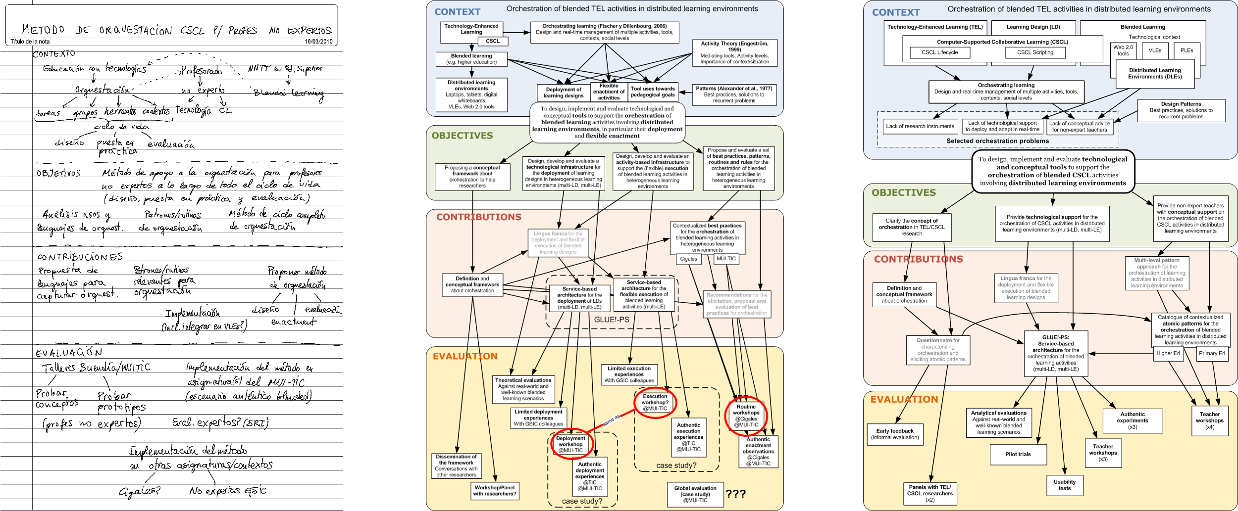
CQOCE diagrams for my own thesis, from the beginning of my thesis work (left), mid-way through it (center) and at the defense (right)
A lot can be said about those particular diagrams (parts of them still make me cringe), but there are three take-aways I want to leave you with: a) your diagram should probably look much simpler than mine (my thesis was too complicated, for reasons I don’t need to discuss here); b) it is OK to hand-draw yours (it is often quicker, and has the same communication power); and c) as you can see in the middle one, it is OK to have incomplete or doubtful parts in it. That is the whole point of the diagram: to identify what parts we are unsure of, or have no idea how to deal with, and see how the conception of our own dissertation is changing over time.
Fast-forward six years, and I still use this kind of diagrams when starting a new research line, especially if it is a collaboration with other researchers, and I have to communicate what the main idea and elements of the research are. Which leads me to…
Why use it - and when not to
There are several reasons why you might want to give this exercise a go (or recommend it to your students, if you are an advisor):
- It is a useful reflection exercise: In the day-to-day life of a Ph.D. there are so many different tasks, reading papers, planning experiments, gathering data, doing analysis, writing your own papers… It is very easy for each of these to become a rabbit hole we pursue. Sometimes these meanderings are useful and prompt a permanent change in how you think about your thesis (they become central to it). Sometimes they are just unnecessary distractions. This exercise forces you to stop for a moment 11, and think deeply, and make your current ideas about what you are doing (and why) visible. Even if you don’t ever show it to anybody else, knowing your direction (or even whether there are gaps in your ideas) feels tremendously empowering.
- As a reminder and prioritization tool. Once you have a version of the diagram in place (even with holes or question marks in it), you can print it and keep it somewhere visible in your office or workspace. And every time you are analyzing data, or reading an interesting paper, or writing your own, or coming up with ideas for cool experiments, you can look at it and think: does it fit or relate with my main problem? is it central or peripheral to it? does it further my contributions? And depending on what your answer is, you can give it a clear priority compared with your other tasks and ideas (or reject it completely… until you finish the Ph.D. at least). Or you can quickly draw a new box in the diagram, if you think it is really important.
- Although the two values above are very important, I think the real killer application of this diagram is as a communication tool: It summarizes, in a single page, what the most important question and ideas of your thesis are, and what you are trying to achieve. It also forces you to decide what the right keywords and terminology to use (something different scientific communities are known to be quite picky about) - and elicit problems with the words you use, once you present it to others. You can use it in your meetings with the Ph.D. advisor (to front-load your topic in your advisor’s exhausted/busy brain), in the introduction to any of your thesis reports (to get the reader to understand how this piece fits in the whole puzzle of your work), whenever you have to write for a “doctoral consortium” or other kind of short presentation about your doctoral work, … heck, you can put it even in your Ph.D. defense presentation12!
However, not everything about this exercise is great, and there are several circumstances where I would not necessarily recommend to use this:
- If you know for a fact that your advisor (or whatever audience you plan to use it with) dislikes diagrams. “Diagrams discourage deep thought and argumentation” - I have gotten this remark sometimes from very respected academics, and maybe they have a point. The diagram is not a substitute for a thoughtful, well-argued text (or conversation) describing where your research question comes from and what your contributions are. It is rather a complement - even if it is a very useful one!
- If you feel that making it is taking too long, or you are endlessly nitpicking about terminology, or you are putting off other important tasks in your Ph.D. to do this (i.e., the diagram has become an act of procrastination). Aside from fully focusing on it when you do it, I also recommend to “timebox” it13. Remember, this is a tool best used in iteration and communication: rather do a half-baked one in one hour and discuss it with somebody, than spend a whole week on it and end up unsure of whether it is the perfect version (tip: it never is).
- If you and everyone involved is crystal clear on what the topic is, or you have your topic and contributions well described somewhere else in relatively short form (e.g., in your initial Ph.D. research plan) - provided that nothing much has changed in your ideas described there.
- If you want to highlight the research methodology you use (a glaring omission in the current version of the diagram) or other kinds of temporal structure or tasks/plans in your Ph.D.. There are other representations more adequate for that kind of thing, like Gantt charts or other task-flow diagrams (I also used some of those in my thesis - maybe a topic for a future post?).
- If you’re not taking the exercise seriously or you think it is utterly useless. But this is a general rule: never do anything you think is meaningless, if you can avoid it :)
Try it out… and let me know how it goes
That’s it. I hope this small tool is useful for you in progressing towards a complete dissertation. Now, this diagram is most useful if you actually go and do it. Get off your seat, go for a walk, then sit down again for one or two hours (with your phone in flight mode). Paint it with colored pencils, hand-draw it in the back of the proverbial napkin, or make a copy of this one for use in your computer, whatever. Bonus points if you then share it with your advisor or a colleague or anyone.
Just do it – and let me know how it goes in the comments.
Update (23.06.2022): We have now added a CQOCE diagram template you can copy to our PhD Toolkit (under the “Conceptualizing your dissertation” section). Enjoy!
Also, do you have other diagrams or thinking tools that helped you greatly in advancing in your PhD? let me know in the comments below - I’ll be glad to share other tools like this in the future.
-
See, for example, this post by Jason Fried. ↩︎
-
Contrary to other universities/faculties, in that field and university it is common to start the Ph.D. with a vaguely-defined research topic and questions. In other places, an initial Ph.D. proposal already has to have a quite clear research question, methodology and research plan behind it (at least, on paper). The diagram could also be very useful even to develop such initial research proposal. ↩︎
-
Ellis, T. J., & Levy, Y. (2008). Framework of problem-based research: A guide for novice researchers on the development of a research-worthy problem. Informing Science, 11. Retrieved from http://inform.nu/Articles/Vol11/ISJv11p017-033Ellis486.pdf ↩︎
-
So much so, that it does not even have an official name, as far as I know. “CQOCE” is just a name I had to invent to write this blog entry! ↩︎
-
Page 6 of Asensio-Pérez, J. (2000). Contribución a la especificación y gestión integrada de la calidad de servicio en aplicaciones de objetos distribuidos (PhD Thesis). University of Valladolid, Spain. ↩︎
-
For example, p. 6 in Hernández-Leo, D. (2007). A pattern-based design process for the creation of CSCL macro-scripts computationally represented with IMS LD (PhD Thesis). Universidad de Valladolid, Spain. ↩︎
-
Probably the first almost-complete version of the diagram can be found in da Silva, R. P. (2004). Contribucion al modelado de aspectos de gestion de aplicaciones distribuidas basadas en componentes en el marco de la arquitectura mda (model driven architecture) (PhD Thesis). Universidad Politécnica de Madrid. ↩︎
-
Page 7 of Prieto, L. P. (2012). Supporting orchestration of blended CSCL scenarios in distributed learning environments (PhD Thesis). Universidad de Valladolid, Spain. ↩︎
-
For example, see the variation of the diagram, adapted to design-based research methodology, in page 6 of Rodríguez-Triana, M. J. (2014). Linking scripting and monitoring support in blended CSCL scenarios (PhD Thesis). Universidad de Valladolid. ↩︎
-
You can also find a more colorful version of it in Google Draw format. Copy it and make your own! ↩︎
-
Pro tip: don’t do this exercise while watching your favorite Netflix show! This exercise is hard, and requires quite a bit of focus. You can use the Pomodoro technique to help you with that. ↩︎
-
Indeed, 80% of my Ph.D. defense slides basically walked the jury around the diagram, diving into some of its elements to present related literature, or details of the studies and results. Nobody complained about that use, in fact. ↩︎
-
Timeboxing is another common productivity technique, in which you basically set aside a limited amount of time (e.g., one or two hours) to focus on a task/problem, and stop once the alloted time ends. No matter what. This prevents the task from filling your whole day (especially if other important tasks also need to be done). ↩︎
Luis P. Prieto
Luis P. is a Ramón y Cajal research fellow at the University of Valladolid (Spain), investigating learning technologies, especially learning analytics. He is also an avid learner about doctoral education and supervision, and he's the main author at the A Happy PhD blog.